- Home
- >
- Help Center
- >
- Website Management
- >
- Homepage Slider and Header Photos
Homepage Slider and Header Photos
If you want to add photos to your home slider, or add a header image for a specific page, there are some things you must consider when choosing the photo.
- LANDSCAPE - Think about the shape of the slider or header photo on your site. It's horizontal, and very wide. Consider this when taking or choosing photos. Your subject matter needs to fit in that space, so a vertical or "portrait" photo won't work about 95% of the time. Even if it's a hi-res photo, and wide enough to be used, once the image is sized down to the proper width, only a small slice of the photo can be used. Standard dimensions for a header or slider photo are 1920 x 700 pixels. If you have a vertical photo that's 4,000 pixels high, think about using only 700 of those pixels. It just doesn't work.
- Composition - If you're taking the photos you want to use for a slider or header, keep in mind you'll be cropping only about a third to half of the photo so the ratio is correct. If you're taking a photo of an animal or collection of birds, make sure you take a horizontal photo, and don't zoom in too close. Keep plenty of space both above and below the subject in the photo so you can crop the center out to be used. If it's your lodging or property, the same rules apply. Get a very wide view of the building or room, and make sure the focal point of the shot is the middle of the viewport.
If you're setting up a new site with us, take a look at a slider on one of your favorite sites, and download the image. Then compare that to a photo you want to use. Are they the same ratio? If not, the photo might not be usable. If you already have slides or headers in your site, download one of them and use that as a guide.
If you are still confused, check out the two photos below. Both are great pictures of a buck, but when they are edited down to the correct size (1920x700) you can see both the rack and the body are cut off. The box image on the left is the proper ratio for a slide or header. The image on the right shows how much of the image can be used as a slide using the same ratio. See the problem here? This is why vertical photos, even square photos or zoomed in horizontal photos don't make good slides. Everything gets cut off. You lose the antlers, the body, or the person's head, etc.


Options:
1. DIY Option - Use a free graphics editing program such as https://pixlr.com/ and follow the instructions above. You can crop, resize, etc. all on your own. How to resize on Pixlr: Open Pixlr E > Upload a photo > Click on the Crop tool or press “C” on your keyboard > Select “Size” as your Constraint (top of page) > Enter the correct pixel Width and Height > Save as JPG
2. 3plains Option - If you need help cropping photos for your website, we're happy to help for our standard hourly fee, but please keep in mind what size the images must be to be used. If they're vertical, square, or less than 2000 pixels wide, they probably won't be usable.
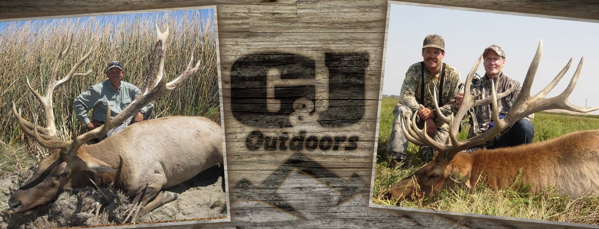
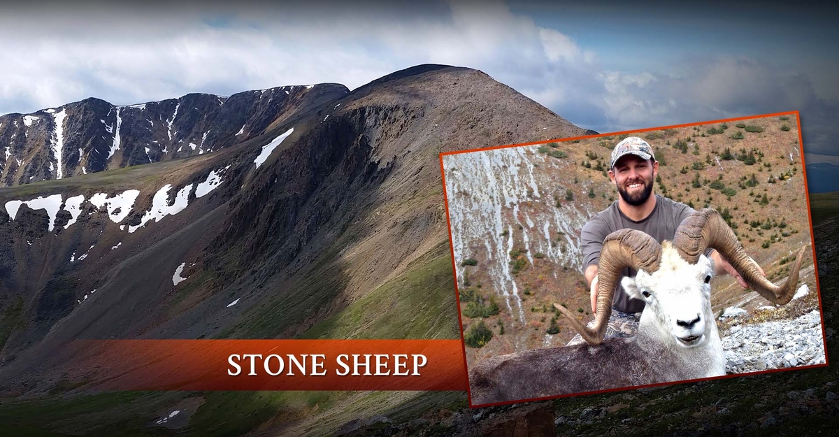
3. 3plains Alternative Options - If you don't have good landscape (horizontal) photography for your website, there are alternative options when it comes to slideshow photos. Our designer can take your smaller photos and create composition slides, or collages like the examples below. However, as this requires design time above and beyond the normal scope of a design package, it's an upgrade that requires additional cost, unless you've already bought a premium package.





Still need help or don't want to DIY?
We have maintenance service and website update packages available. Please fill out a ticket and a 3plains representative will reach out to you with details on pricing and packages.
Last Updated: 2024-03-17
Back to Website Management