What does Mobile-Friendly really mean?

If you have a website, you've heard the term "mobile-friendly" before, and possibly even had to ask someone what that meant and how you could update your website. The first thing you need to understand is that just because you can pull your website up on your phone, it's not necessarily "mobile-friendly" because nearly every website out there can be viewed on a mobile phone. Google has a specific page set up for you to test whether your site is mobile-friendly or not.
https://search.google.com/test/mobile-friendly
Plug your website in to check how well it holds up. You might be surprised. Along with our 3plains website, we've upgraded our Client Portal (our Content Management System) to be 100% mobile friendly, making it easier for our clients to edit their websites on the go.
If your site is not mobile friendly, Google is penalizing you and your site will be pushed much further down in the search results until you rectify the situation. Here's a quick article from Tech Crunch explaining what's going on.
Aside from Google hurting your traffic, here are a few other reasons why upgrading to mobile-friendly is crucial to your business.
- Unfriendly sites appear greatly zoomed out, and are impossible to read without "pinching and zooming" with your fingers. Pinching and zooming is very unfriendly for users so you will see a noticeable drop in traffic. Aside from readability, all the links are very tiny and very difficult to click. If I get to a site that isn't mobile friendly I'm out immediately. Over 60% of web traffic is via mobile. If you aren't mobile friendly, you might as well sell 8-track tapes.
- Unfriendly sites also look very dated, which makes people uncomfortable, which makes them less likely to dig further into your site or eCommerce store. If they aren't comfortable, they'll bounce.
- Touch. Friendly. Your site must be touch friendly or you will simply lose your audience. When you see a "hamburger" menu item on a site, it's more than likely mobile-friendly. It's the three bars stacked on top of each other commonly placed in a top corner of the website. Click the hamburger, a navigation menu drops, slides, or appears so you can navigate the site. This is simply the new standard and everyone who uses websites on a mobile device understands how they work. If you're site isn't part of the standard, people will simply go elsewhere.
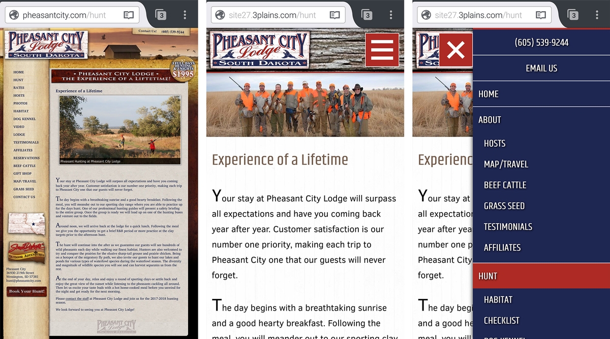
Here's a recent example of a client moving from an outdated design to a mobile-friendly framework.

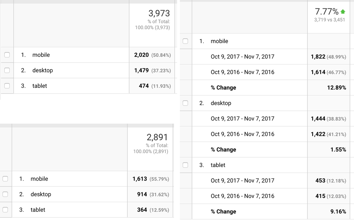
Notice how much easier it is to read the content. The menu is large and easy to use. No pinching or zooming necessary which is exactly what users want. This is the way the majority of people digest content on the web, so if you aren't interested in keeping up with the times, you will unfortunately be left behind. Here are some recent traffic numbers from our client sites. Note the amount of mobile traffic for each one.

Granted, there are sites out there still doing just fine even with the Google penalization. While that might be fine for some, the future is only going to bring more mobile traffic, and more expectations. If you want to stay relevant moving forward, a mobile friendly website is required; if not now, sooner than you think.
When you're ready to talk, contact us and we'll make the process simple and affordable.
Posted in: Web Design, Content, Mobile