
How Do I Come Up With A Logo Concept?

Coming up with a logo for your business can be difficult, especially if creativity isn't one of the tools in your wheelhouse. Here's an example of how we created a logo based on a concept that captured the essence of the client's business.
Initial Idea
Every logo begins with an idea or a feeling(s) to convey. Before we ever put pencil to paper, we have an in-depth consultation with the client commissioning the logo. In this case we were given a lot of photos to reference, as we were also building a new website for the client. This allowed us to ask some targeted questions, and pick up on reoccurring themes in relation to this client's business.
Here are a few of the photos we looked at while consulting and brainstorming for our logo concept.

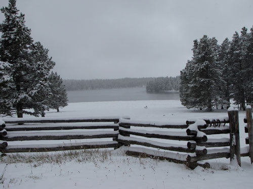
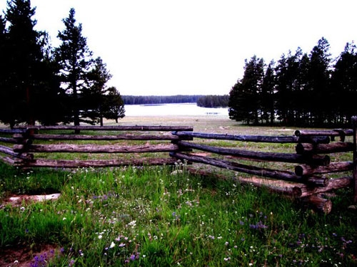

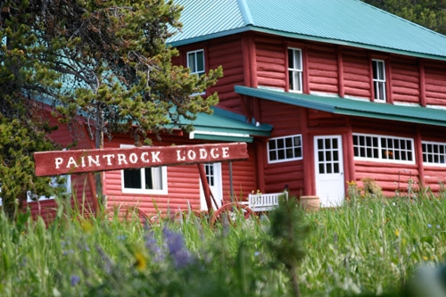
We all agreed that this client's location in the mountains of Wyoming was a focal point of their business. It had a ruggedness and remoteness we wanted to convey. We also noticed the log fence that seemed to take center stage in image after image we referenced. It seemed to be another focal point but we weren't sure.
Concept Mockups
Our designer Justin, put together initial mockups for the logo based on our location concept. In all the mockups the mountains were highlighted, and referenced directly from the clients own images. Some concepts included the log fence as well, and allowed him to experiment with a few supporting font ideas. The title font was referenced directly from the client's lodge sign, and was approved almost immediately by the client. It is bold and strong and easily reproduced as embroidery on hats, clothing, etc.
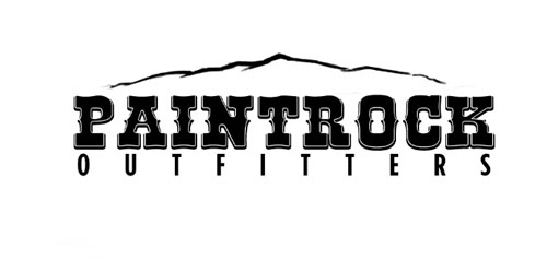
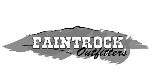
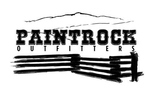
Once the client was able to view the mockups we were able to combine elements from a few of the mockups into one solid logo. It turned out that the log fence was indeed a good way to illustrate the history and tradition at Paintrock, while at the same time furthering our idea of ruggedness in how the fence was "drawn" and portrayed in the final revision.
The Final Logo
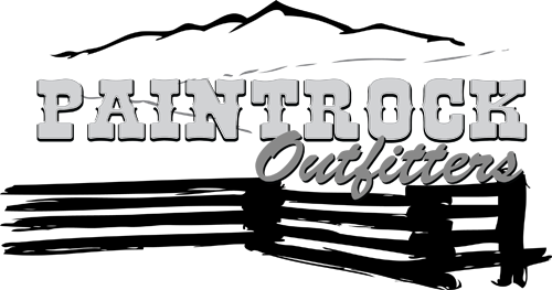
The final completed logo. The final logo was delivered in black and white because Paintrock Outfitters decided they wanted choose colors with their merchandise vendors based on output rather than choose final colors with 3plains. We firmly believe that a great logo must be strong and able to convey its meaning in black and white before adding colors to the process. This allows a new logo to succeed regardless of how it's reproduced.
Final Thoughts
Creating a logo can be long and difficult journey, but with a thoughtful concept at the beginning, it can be a smooth and rewarding process. We challenge you to come up with your new logo concept and submit it to us today.
- 3plains
Posted in: Logo Design, Branding