Hunting Outfitter Logo Update & Rebrand

A client called 3plains looking for brand overhaul along with a logo re-design, trade show booth design, marketing brochures and business cards. Let's take a look at the re-brand.
New Logo Ideas
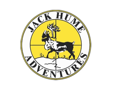
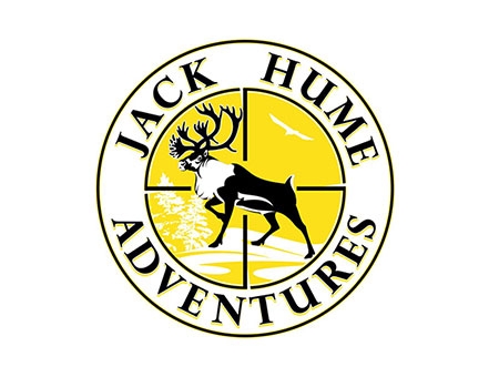
Talking with the client, we presented several new concepts along with different colors and different layouts. After all the concepts were presented and honed down, it was decided that the logo needed to stay round, stay yellow and keep the caribou and cross-hairs in the middle to keep the recognition that the company reputation had built since 1978 and has been their brand for decades.
This turned out to be a great decision and final product to keep the brand intact but to present a nice fresh and modern logo.
Old Logo
The old logo cross-hairs were touching the caribou, the caribou as shown walking across what represented tundra It's the tundra moss and rocks.

New Logo
After a few different variations, both parties agreed this was the winner. Cross hairs don't quite touch the caribou, caribou and rack more life-like and overall body as a whole. We added white trees, tundra and eagle flying to represent the hunting environment in Canada.

Other Branding Materials

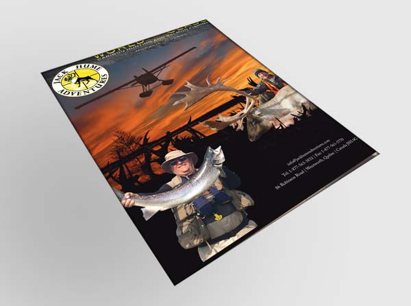
Brochure Design

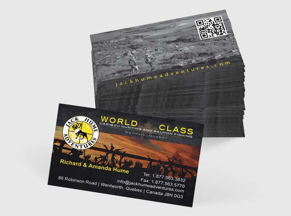
Business Cards Design & Printing

Trade Show Booth Design and Backdrop
Posted in: Uncategorized, Logo Design, Branding, Print Design, Trade Shows, Marketing