Trade Show Season is Near

Trade show season is right around the corner, so we decided to show a example of a booth we designed this summer for a South Dakota pheasant hunting client.
Client
Buffalo Butte Lodge
Website
www.buffalobutte.com
Location
Gregory South Dakota
Business
Guided Pheasant Hunting
The Booth Design
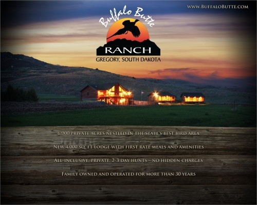
The booth design was simple. We felt like a lot of the South Dakota pheasant hunting customers don't have the nice scenery like Buffalo Butte Lodge's location. So, we decided on a nice sunset photo with the lodge lights on to make the lodge really pop at the base of the Butte's. We took the photo at sunset at a low shutter speed on a Canon 40D.
The logo was put in the middle and the website address up top because we wanted a minimalist and simple approach to this booth. We wanted potential customers to walk by their booth and not have to process a large amount of information on first glance.
For photos, they decided a flat screen Samsung TV in which we recommended to show off their high quality hunting photos. Brochures were recommended handing out to qualified customers and a list to take down of those qualified leads.
The end result turned out quite good and we felt it really has a high class look to set them apart from the other pheasant hunting lodges at the spring trade shows.

Backdrop Display

Table Cloth
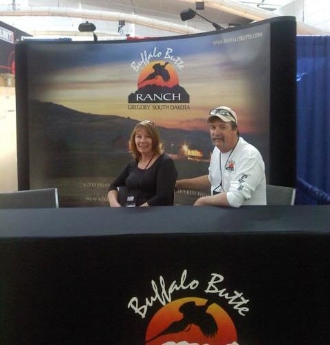
Photo From the Client (Pittsburg NRA Show)
The client was happy with the end result. The tall table that they have does hide the wood grain and text at the bottom of the booth. They knew that going into it, but don't really care as they like the tall table and tall chairs since they say it's easier on their backs. A smaller table off to the side is what we originally recommended. Either way, the booth will work great in either regard.

Posted in: Branding, Print Design, Marketing