
Mobile Friendly Website Example

Last month you received a email from us about Google's mobile update in their algorithm or "mobilegeddon" as the media was calling it. We posted a blog update 2 weeks after the Google Update that websites were not plunging in the rankings like some fear-mongering companies were saying but seeing a slight boost moving you up potentially a few spots in the Google results.
We did hear from several of our customers asking about what is all entailed with moving their website over to a mobile friendly design and what makes a website "mobile friendly". So let's take a look at one of our fishing website design customers Aabsolute Charters who moved their website over to a mobile friendly design last week.
What is considered a Mobile Friendly Design?
If you have pulled up a website and had to turn it sideways to read the text or had to "pinch" your fingers to expand the text, then your website is not considered mobile friendly by Google. View the above photo in this blog post to see the difference.
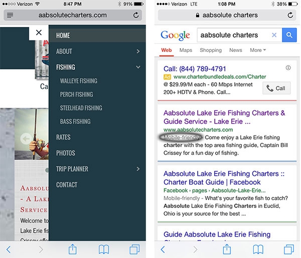
In the image below, the left image is a mobile menu that expands out from the right side of the phone after clicking on the menu icon in the upper right corner. This is considered a mobile friendly design since the website is easier to read and the design differs from the iPad, laptop and desktop versions.
In addition, in the image to the right, searching Google on your phone shows that Aabsolute Charters is considered "mobile-friendly" as you can see by the Mobile-friendly grey text in the Google result pages. If you don't see this Mobile-friendly text next to any website, Google does not consider it mobile friendly and have publicly said it will affect your results in the Google results on mobile devices.
How does my website look on multiple devices
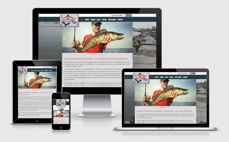
If you want to take a look at your current site on the desktop PC, Laptop, Tablet and Mobile device, use the following link: http://ami.responsivedesign.is/ Keep in mind the mobile device is the only device that the Google update is impacting.
Let Google Analytics tell the story
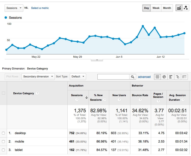
Looking at Google Analytics for the Aabsolute Charters website shows 34% are mobile users and another 12% tablet users. Every industry is a little different so we encourage you to take a look at your website analytics and see what percentages your website traffic shows.
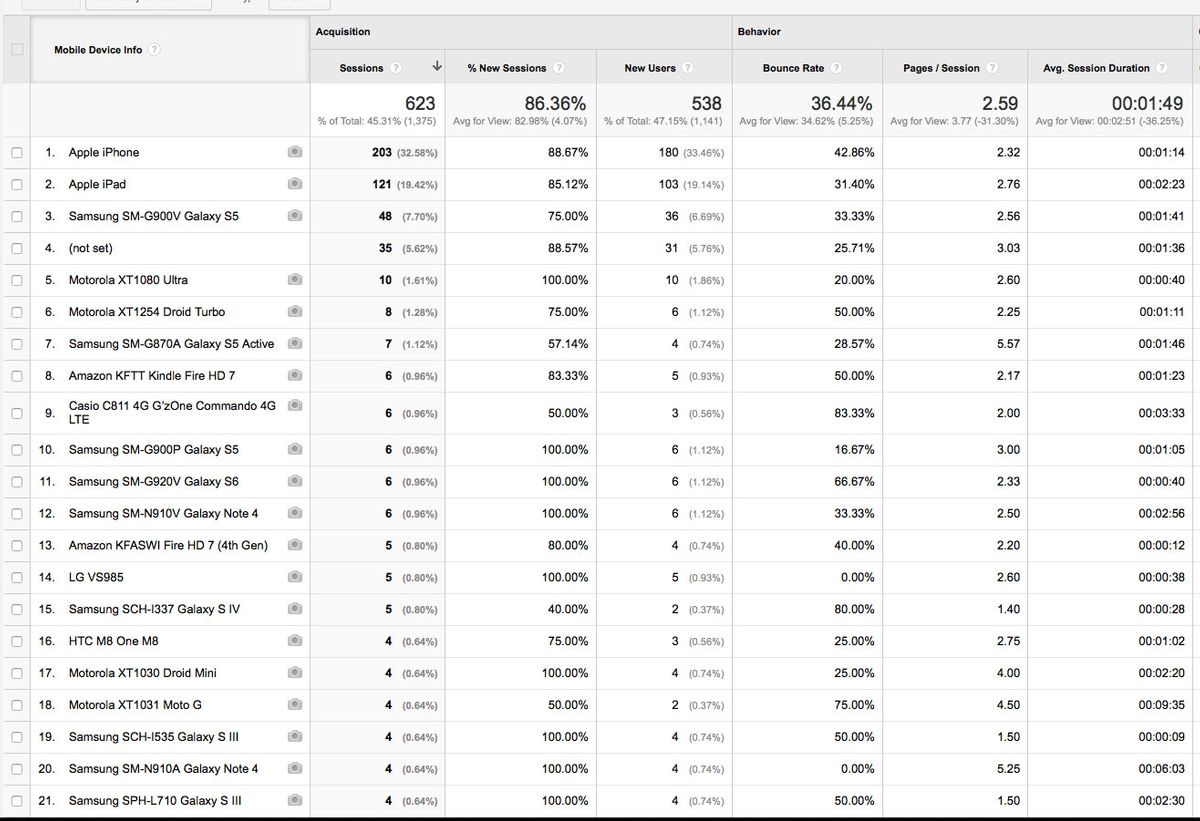
As you can see, there are a wide variety of mobile devices.
Google Mobile-Friendly Testing Tools
There are 3 great tools you can use to test your current website.
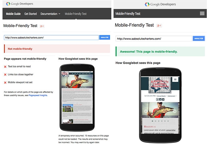
1. Google Mobile-Friendly Test
Use the Google mobile friendly test tool which is pretty self-exploratory: https://www.google.com/webmasters/tools/mobile-friendly/
2. Google Search Console Tool
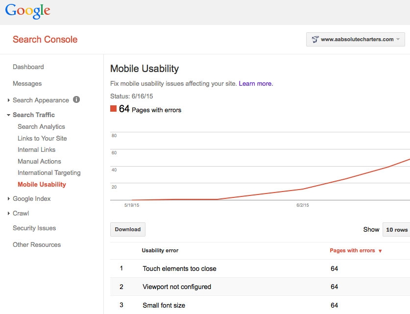
If you are not using Google Search Console or don't have 3plains take care of your marketing you will see Mobile Usability errors spike. As you can see by the image below, Google considers 64 pages to have mobile usability errors. These errors will disappear soon enough as Google picks up the new mobile friendly design we have created for Aabsolute Charters. You can view the Google Webmasters tool (now called Google Search Console) here: http://www.google.com/webmasters/
3. Google PageSpeed Insights Tool
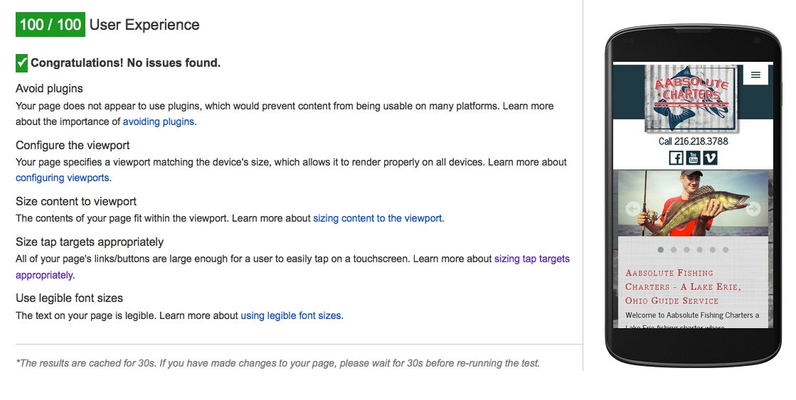
The Google PageSpeed Insights tool is a good one to see User Experience and other data about your website. Punch in your website here and try it for yourself: https://developers.google.com/speed/pagespeed/insights/
Want to Make your website mobile friendly?
Over the past few years we've seen significant advances in technology, web browsers, and search engines standards. Google uses these standards as part of their algorithm and modern web browsers use these standards to make sure your content is viewable by people using a PC, Mac, smart phone, or tablet device.
If your website hasn't been designed in the last 2 years we need to talk about website re-design options since your website design is now considered a legacy design or legacy website. If you have designed a website with us recently, we have an add-on for your website so you are all set to go for this Google update.
Contact 3plains to discuss a mobile friendly add-on or a total website re-design.
Posted in: Uncategorized, SEO / SEM, Marketing, Mobile