The Ever-Changing World of Website Design

One of the hardest parts of my job is explaining why I make the choices I make when designing a user interface for a website. Graphic designers, developers and ultimately clients all have things they insist are required or unnecessary.
Designing for the web is a rollercoaster ride of fads and technology. Every time someone comes up with some new trick with HTML5, or CSS3, or even a javascript library everyone wants to jump on the bandwagon to “keep up with everyone else”. Here’s the problem with that. The latest fads don’t work for everyone. New languages and new technology aren’t always better. The old adage “if it ain’t broke don’t fix it” rings truer than ever these days.
Of course new technology CAN work well for some people but it’s by no means right for everyone the day it comes out. Parallax is a perfect example. Everyone lost their minds when they first saw it. Text and content scrolling over various images that move independently depending on how you scroll really is cool to see; for about the first five minutes. Then you realize the page is insanely slow, clunky to scroll, and ultimately distracts the user from absorbing any useful content. Yet agency after agency implemented it on all their sites because it seemed to get clients excited, but that’s not a good way to service your clients. Just because it’s popular doesn’t mean it’s good for your site, and in many cases it can actually drive traffic away because it’s simply not a usable website on smaller devices or older systems.
With the sheer number of "smart" devices and interfaces cropping up every single day, usability is more important than ever. How many websites have you visited where you can’t find the navigation, or you can’t figure out what is actually clickable? This is the fallout from everyone trying to be “unique” with their interfaces. It’s definitely a major concern for all my clients. “I don’t want my site to look like everyone else’s. I want my site to look really ‘professional’ but I want lots of different graphics without cluttering up the header.”
Not everyone will agree with me here, but the days of having a “really unique site” are over if you want to do ANY e-commerce or showcase your business in a way that will draw clients to your product. Yes, I’m saying you DO want your site to look like everyone else’s where it counts. Make all the arguments you want, but here’s why I say that.
Have you ever used an ATM where the buttons didn’t make sense? Where the interface didn’t make it obvious what you need to do? Maybe you did when they first came out but now no matter what bank or system is running that ATM, it’s built to make it easy for people to withdraw money because they ALL WORK THE SAME.
Picture a gas station and the layout required to pump gas. If you need to get gas are you picking the station based on the signage? Is it based on how clean the station is? Does the brand name make a difference to you? Personally, I want a gas station that makes it as easy as possible to get my gas and get out. Cleanliness is a factor if I want to go in and get a snack or use the restroom, so in that case I choose certain stations over others based on personal preference.
Now imagine you see a gas station on the side of the road with a big glitzy sign, lots of lights, and a really futuristic look to it. “Wow, that gas station looks insanely cool! Let’s get gas there!” Then you get to the entrance and you don’t even see the gas pumps. You see a number of ramps and garage doors, but no indication as to where you pump gas. You park your car and begin exploring but you can’t even find the entrance to the store. It’s nothing but lights, bells, whistles, and confusion. How long do you stick around before you decide your old reliable gas station is where you’d rather get your gas?
Websites are no longer a showcase for graphics, crazy designs and cool visual effects, unless that’s exactly what you’re selling to people. There is a market for that type of interface and it works for some businesses, but it’s a very small percentage. Everyone is connected, and the average drop-off time for users on a website gets shorter and shorter every year. People don’t WANT distractions, they want content and they want it right now.
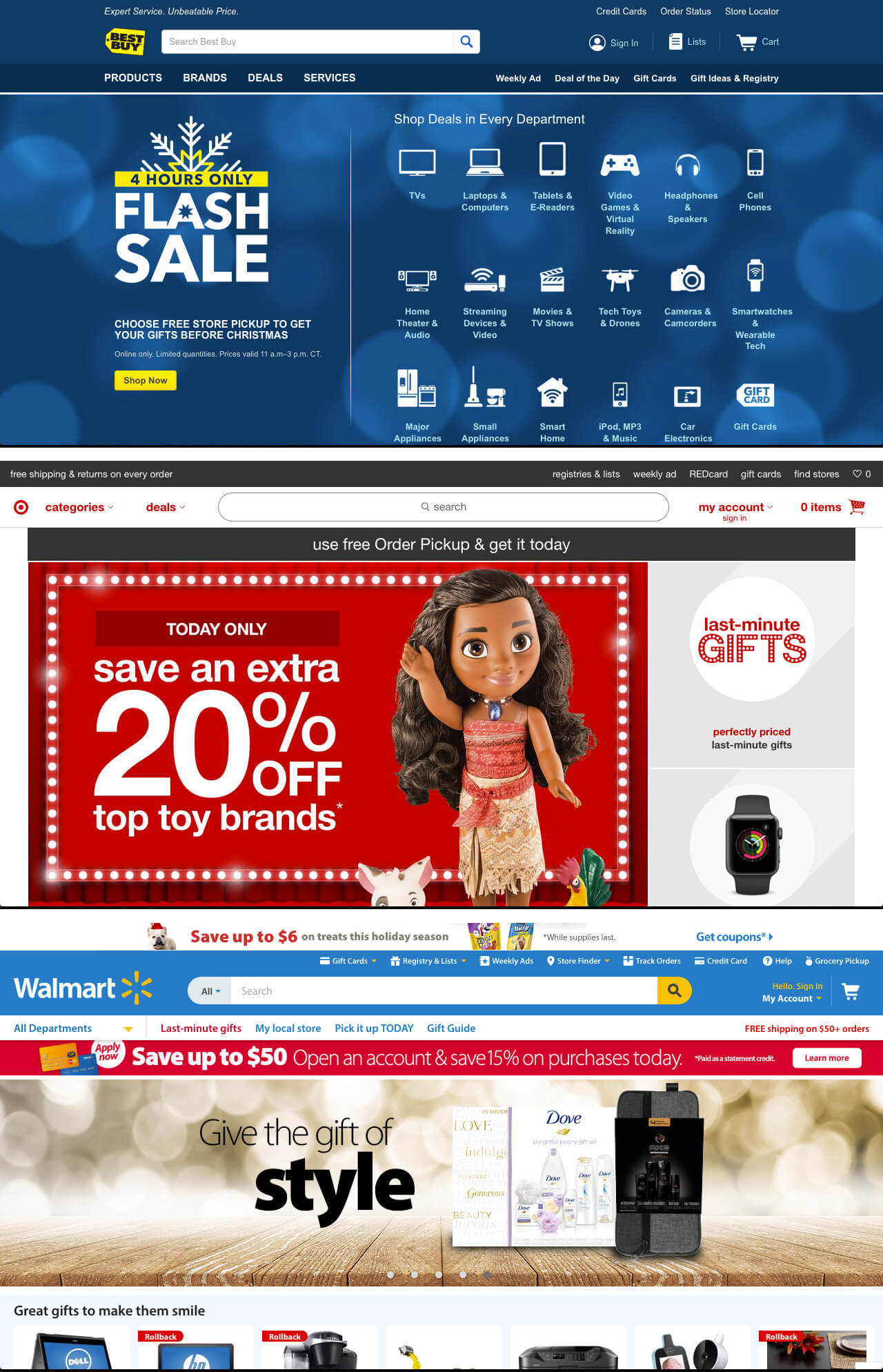
This is why you WANT your site to look and function like everyone else’s. People want to feel comfortable on your site. They want it to work exactly like what they’re used to. Let’s take three major big box stores and do a quick comparison.

Take a good look. They are all designed identically. Sure the link order varies between sites, and the big “home page callout” directly below the main navigation is a bit different, but notice the overall theme? All three prominently feature the search bar. They all understand people are going to search for what they want IMMEDIATELY, so make it easy for them to do so. They all put the cart graphic and links to it in the same spot in the upper righthand corner. They all feature alternate links in the top bar for things like gift registry. They all highlight all the major retail categories prominently on the home page. See the pattern here? They understand their user base, and they want to make it as easy as possible for them to use their site and in turn purchase their products.
It all comes down to usability. It’s GOOD to look like everyone else in your industry because it makes people comfortable visiting your site. Nothing is confusing, navigation is easy, and the content is readily digestible. Now, of COURSE you want your site to reflect your brand. Graphic design should ENHANCE the user experience, not complicate it. Your logo and brand are the most important part of the overall theme, but the usability needs to be clean, simple and recognizable to anyone using your site. If you’re an outfitter looking to sell hunts or fishing trips on your resort, make it easy for people to do so.
If you want to drive revenue and sales, that’s where SEO/SEM, marketing and advertising come in. Get people to COME to your site, and make it as easy as possible to use. The website isn’t meant to attract people, it’s meant to service the people that find you. If a hunter wants to hunt in Kansas, they’re going to hunt in Kansas. They aren’t going to choose the outfitter that has the most unique website. They’re going to choose the outfitter who comes up high in the search results, and upon visiting your website find an easy to use site that makes them feel comfortable booking with you. Show off your resort. Make it very easy to book a trip. Make it obvious how to contact you. Don’t distract them with too many graphics or hard to find information. That’s where they drop off and find someone else that has a website they’re comfortable with.
Here at 3plains we aren’t looking to churn out cookie-cutter websites, but we ARE looking to design your site around a very usable interface that makes your clients feel comfortable booking with you. Focusing on your brand and logo will make your site unique, and a common usable interface will make the experience of using your site much more enjoyable. We’re experts in this industry and we’ll happily talk with you about our process as we build you the best product we can.
Contact us now to get started!
Posted in: Web Design, SEO / SEM, Branding, Advertising, Content, Marketing