4 New Custom Hunting Logos

We've had a lot in the works in the way of custom logos here at 3plains for some time, so we thought it might be a good time to let you take a look at a few of them. We're still working through our current backlog of custom logo requests, but with taking the time to do each and every logo right, the work can often be slower than anticipated. It's really great to be able to share some of these finished designs with you. We can't wait to see them being put to use in the field.
1. KB Style Adventures - Eads, Colorado
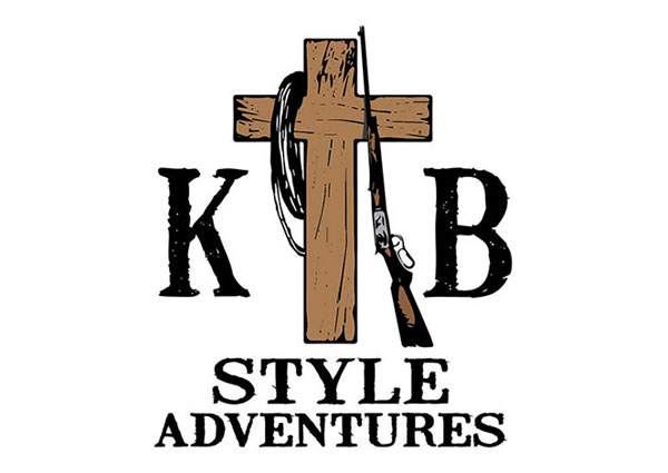
Kevin, at KB Style Adventures in Colorado, was very clear on the nuts and bolts of his new logo. The wooden cross, the rope, and rifle all needed to be there. In fact he even stated for us very early on, "I can see the rifle leaning on one side, and the rope hanging from the other." The only difficulty then was balancing the business name into the logo. We experimented a lot, but were ultimately inspired by some simple cattle brands, which set up the symmetrical "KB" initials, in the final logo.
2. Lone Pine Pheasant Club - Lone Pine, California
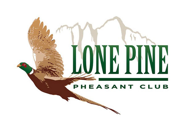
Lone Pine Pheasant Club gave us unprecedented thought and research going into their new logo creation project. As a refresh of an old and outdated logo we introduced some realism, depth of field, and the unmistakable landmark of Mt. Whitney in the background. We think the new logo honors it's predecessor while taking a big step forward, and should look great out in the field at Lone Pine Pheasant Club in Lone Pine, CA.
3. Lac Seul Lodge - Ontario, Canada
Lac Seul Lodge needed to start from the ground up with their marketing brand, identity, search engine optimization and overall marketing campaign. Fishing in Canada is a timeless pursuit, and we wanted to infuse Lac Seul Lodge's new logo with this timelessness. We kept things simple and classy with a centered Walleye jumping, and text that was easy to read, yet stylish with just a touch of rustic appeal.
4. S&J Outdoors - Texas
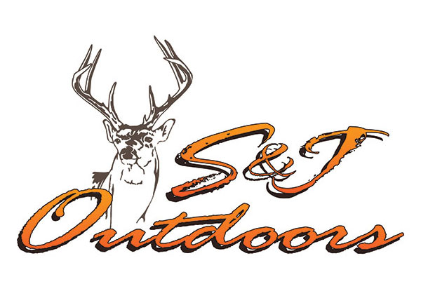
The S&J Outdoors Whitetail logo we put together for Jake Crews was inspired by a buck he'd harvested himself and had mounted some time ago. The reference images were spot on, and we drew a single color representation of his buck by hand to be the centerpiece of his new logo. Jake knew he wanted orange and brown, so with a few font variations in place, we were able to narrow down his final design in just two revisions.
Posted in: Logo Design, Branding